Making an accurate prediction of the weather ahead of us is a science many attempt to master but fail. However to be fair to them, the hard part about predicting weather is to do it without being in the same place. We all understand that a dark sky usually means bad news. A cloudy sky with a strong wind usually indicates quickly changing weather. While a bright, warm sunny day with minimal wind brings out the shorts and flipflops. All of us can, with a little bit of practise, become relatively good at predicting the weather where we need it, when we need it. We don't even have to go back to school for it either but instead understand a few simple things.
Firstly we need to understand what makes the weather tick. Then we need to find a few good sources that allow us to be lazy and not interpret everything ourselves. Finally we just need to be a bit alert about what is going on and engage brain (only a little - I promise).
What makes the weather tick?
To keep it nice and simple - weather is all about pressure. Differences in pressure within the atmosphere around us, whether on a global or local scale, create the weather systems surrounding us every day. Although this is an incredibly simplistic view and my inner geographer is holding his ears, it is a vital consideration when making weather related decisions. 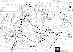
The map you see here (click on it for larger version) is a synoptic atmospheric ground pressure chart. These charts are the bread and butter of any amateur weather "predicter" (weather forecaster would be a step too far). We can analyse synoptic charts vey easily in order to gain an understanding of the weather ahead of us. There are three main components to the map that are of interest to us. Firstly there are the isobars, the actual indicators of pressure. These are the black lines often forming closed circles around areas of high or low pressure and sometimes displaying numbers. Isobars are areas of common pressure so all places on an isobar share their pressure, much like isopleths (contour lines) on a map. The thick black lines are fronts, troughs or ridges. Fronts come in three types, warm fronts show triangles, cold fronts show semi-circles and occluded fronts show both. Troughs and ridges do not have any symbolisation attached. However, for our purposes we consider all three to be equal. Finally we are interested in the big Ls and Hs indicating centres of low or high pressure as these give us some indication of predictability and influence of the weather. Whether we are under high or low pressure also dictates the wind direction. Generally speaking the air turns clockwise around High pressure and anti-clockwise around Low pressure in the northern hemisphere. In the southern hemisphere this is inverted.
Once we know roughly what the symbols are we simply ask ourselves the following questions in relation to the area we are interested in (in my case the southern UK). The interpretations are the key but the questions are good reminders once you're used to using them:
Is the overall situation clear or chaotic?
This one is easy really - look at the map overall and decide whether it is clear with little information displayed or overflowing with information.
Our example would sit somewhere in the middle of this but more on the chaotic side.
The more chaotic the weather on the map the harder to predict what is going to happen in the real world. A nice clear map will usually mean the weather is not going to change much. Chaos on the map however indicates chaotic and changeable weather.
Is the area under high or low pressure (which one is closer/moving in)?
Weather in our region usually moves from southwest to northeast. Therefore we are more concerned with what comes from the southwest than what moves away in the northeast. A low pressure influence usually indicates wet and cold weather heading our way - think winter storms. High pressure indicates clear and warm weather - think bright summer days. Frequently changing pressure influences indicate changeable weather - think Autumn or Spring weather.
Are the isobars over the area tightly squeezed or widely spaced?
Generally speaking the tighter the squeeze on the isobars, the higher the wind speeds. For the UK count the number of isobars over the UK, multiply by 10 and you get a rough idea of the maximum wind speeds on the hills in miles/hour. Halve this for lowland areas. These are only rough figures, but they provide a good starting point for planning or decision making.
Where does the wind come from (High clockwise, Low anti-clockwise)?
Wind direction is important in order to understand whether we will have dry air or moist air. The direction also gives a clue as to the influence of the weather - maritime (wet/cool) for westerly, continental (dry/cool) for easterly, polar (cold) for notherly and saharan (warm) for southerly. Knowing how the wind turns around an area of pressure and combined with the isobar count gives us a reasonably accurate prediction. Where pressure zones are closely packed or conflicting this becomes problematic and difficult. This is why a clear map is easier to predict than a chaotic one.
Is our influencing pressure hotspot over land or sea?
If our pressure influence lies over the sea the air will be wetter, if it is over land it will be dryer. Over the sea, weather systems tend to gather more moisture forming clouds. They deposit this moisture over land causing rain.
Are any fronts, ridges or troughs crossing over the area?
The easiest way to use these features is to associate them with rain. A front, ridge or trough passing over indicates a change in pressure of some sort and can usually be associated with rain on land. The main difference lies in the formation of clouds and the temperature of the air masses. Warmer air follows a warm front, colder air follows a cold front and occluded fronts tend to have cool air leading and trailing them. As an additional hint the symbols on fronts indicate the wind direction - just see them as arrows.
Armed with all of this information most of us could now already interpret a weather map such as our example reasonably well. So let's take a closer look:
The weather situation is changeable (chaotic) under a low pressure influence with high pressure moving in. Winds are slight and moderately dry from an easterly direction with a land influence. This indicates cool conditions. Despite the dry air a series of occluded fronts will bring rainy conditions and a trough could potentially be brushing us later as well. So all in all a calm, cool, wet but possibly improving outlook.
So which forecast is right?
In short - none of them are. Much like a map, the weather forecast always lies. There are however a few sources that I personally trust more than others. Why exactly is out of scope of this post but personal experience is a good excuse. So here are my top three go to websites for weather forecasts for the UK and my two sources of synoptic charts:
- www.yr.no - The Norwegian weather service is probably my favourite. For a generic overview and long term predictability this one is hard to beat.
- www.mwis.org.uk - The mountain weather information service provides specialist information for the UK mountain regions. Very accurate and very specific to the outdoor activity sector.
- www.metoffice.gov.uk - The metoffice is the national weather service for Great Britain after all and unbeatable for up-to-date situations around the island. The long term forecasts can be on the pessimistic side though.
For the maps:
- www.mwis.org.uk - Under "animated synoptic charts" the UK synoptic is easily available.
- www.wetter3.de - An invaluable source of weather charts. Spend a bit of time translating the individual terms from German into English and you will discover a treasure chest of information.
To answer the original question here is my genuine strategy:
I constantly monitor the weather for regions I'm interested in using www.yr.no and www.metoffice.gov.uk . About a week before any outing I start looking at the daily synoptic charts and combine my findings with the most closely related forecast. Using this remaining site to monitor the long term trends (the changes between weather patterns) allows for a reasonably accurate prediction of the upcoming weather. Finally the synoptic charts combined with high quality local weather (such as www.mwis.org.uk ) give the final indication of how fast the expected patterns will pass over.
Effectively I combine the professionally forecast patterns (which are surprisingly accurate) with my observed speed of movement (charts are derived from observed data) and get a reasonable picture.
What to watch out for?
Generally it is advisable to practise predicting the weather like any other skill. Over time the ability to relate scenarios on the weather maps to the real world cloud formations and weather patterns will develop. Especially monitoring the sky during the approach and retreat of fronts, ridges and troughs is useful. With regular practise you soon will be able to look at the sky and give a decent 6-12 hour local forecast without really needing any observed data. Yes, there will be times when this simply does not work, but by and large it will allow for some degree of preparation in terms of conditions.
Categories: Climbing, Mountaineering, Outdoors, Skills
Comments: No comments yet
Leave a comment